Wednesday, November 25, 2009

Speaking with Animation

For this blog, I chose a short animation (45 sec.) done by one of my favorite artists, Lois van Baarle. She is an illustrator and computer animator from Holland. Her work is amazing, and I would highly recommend checking out her website, loish.net. The animation I chose was done for her Paperbag Parachute Studio website. The project is entitled, "Paperbag Parachute." It features four main characters, three monkeys on a branch mocking a fourth lone monkey on another branch. The style of the work is 2D animation which happens to be the traditional animation style, used in classic cartoons. She created the animation using a tablet stylus and produced in Flash.

The animation begins with an overall view of the environment, a desert perhaps with some trees spread out across the plain (she gives off the illusion of 3D by placing some trees further on the z-axis creating 3D depth in a 2D environment), then three monkeys appear on a branch when suddenly a fourth monkey appears from above on a separate branch. The fourth monkey, who is styled somewhat differently (different color, bigger hair, lop-sided eyes) from the first three monkeys, gives a friendly wave at the three monkeys on the opposite branch. His endearing gesture is met with lively laughter from the three monkeys, then the taunting begins, and the fourth monkey does not understand what is so funny. Then one of the three monkeys takes out a pen and paperbag, draws a happy face on it and throws it over the fourth monkey's head. The clouds roll in from above and the skies become dark and lightening strikes the tree of monkeys. The tree collapses along with the three monkeys, but the lone fourth monkey remains afloat due to the paperbag parachute.

This whole piece was meant to show that in life, there will always be people who put you down for being different, but what goes around comes around and the one who was taunted will one day rise to the top. It was also the inspiration behind her animation website, paperbagparachute.com. My only criticism is that the animation contains no sound, which is somewhat disappointing. I felt that by adding sound, it would have greatly elevated the user's experience and engaged the viewer more.

With that said, I hope you enjoy this piece as much as I did, check it out: http://www.youtube.com/watch?v=TF1tWCdesMw


Jenni

Thursday, November 5, 2009

Best Movie Ever!!!

Special thanks to Tal!

Post Production Notes

Where to start? Planning my first 3 minute documentary about the music people listen to was exciting, drawing out the storyboard was the first step in making my mini-movie come to life. Shooting the actual footage used in our documentary was challenging, I learned a lot about framing the interview participant with concerns to lighting, I also learned that acquiring sound with the camera microphone isn't the best way to capture sound outdoors. I had trouble hearing some of my interviewees outside of Hunter, the ambient sound was too strong and during post-production, I had to edit these interviews out. I was surprised at how willing the students at Hunter were to be filmed, all interview participants were extremely friendly and I found the entire shooting experience to be fun and fulfilling. I was able to interview a number of people during the short time we had during class, which is something I was worried about during pre-production.

Editing the video was an entirely different story, I discovered that editing even a short documentary is tedious and requires a lot of time and effort. The first time Tal and I began editing our footage we worked for about three hours only to discover that we were unable to save our project. Due to this setback, we had to start editing all over again. However the second time we were able to edit, we really had an idea of which shots we were going to use and which ones were completely unusable. Our transitions between scenes really began working once we added our soundtrack to the piece. It made the documentary flow a lot easier and helped with our continuity. Overall, I thought the piece came out great! It was short and to the point and thanks to planning, it came out the way I hoped it would. If I had to change anything about the process, it would be obtaining a better microphone, a lavalier perhaps, this captures sound better than a camera mic. I have learned that capturing sound is just as important, if not more important than capturing images.

This whole experience really makes you appreciate all the hard work that goes into making a film or documentary. While watching an edited film or video, you never really even think about all the effort that took place in order to make the piece, now when I watch films and other media, I think about the steps someone made to capture that one shot and the amount of editing someone did to ensure continuity. Thanks to this project, I have a greater understanding of how films/videos are made :)

Jenni

Monday, October 12, 2009

Editing Analysis: The Office Wedding


The Office is a half-hour comedy show on NBC, it's collection of unique and hilarious characters always manage to put a smile on my face. If you have never seen the show, I highly recommend checking it out! They really outdid themselves in the last episode, the long awaited union of Jim and Pam, the show's main couple whose relationship took three seasons to come to fruition. Jim and Pam, otherwise known as “Jam” by fellow bloggers, finally got married! The show decided to use a montage or as we learned in lecture, a series of shots assembled in a way that the juxtaposition of the images create meaning. Montage is associated with Soviet filmmakers of the 1920’s, like Sergei Eisenstein. The special hour-long episode ended in a YouTube video spoof on an actual wedding, http://www.youtube.com/watch?v=4-94JhLEiN0.

The clip begins with brief dialogue between Pam and her maid of honor. Pam says that she specifically requested the song, Chris Brown’s “Dance Forever,” not be played on her big day, the cast however, had other ideas. Soon the entire cast of The Office is seen dancing and waving their arms down the aisle, a great scene of jubilance and love. The shots are meant to document the church wedding as well as the pre-wedding of Jim and Pam on a boat at Niagara Falls, the weddings were then mashed together to form one long, continuous wedding.


The song and rhythm play an important part in setting up the scenes to follow, group by group, characters dance down the aisle then reemerge for a collective big finish. In one of the last scenes, the music ends and Jim is seen explaining his plans for the wedding day, then they cut to a shot of the couple from over the shoulder, the camera then swings to Pam's profile and Jim is seen smiling. This final shot, for me, was an amazing example of editing that made a significant contribution to the storytelling and feel of the piece. The scenes begin with great excitement and music, by the end of the piece, it is calm, quiet and peaceful happiness, one smile from Jim, the piece ends and hearts melt. The clip, a little over three minutes long, ended up getting great reviews from bloggers and fans, those who had already saw the YouTube video and those who had just seen it for the first time, were both able to appreciate The Office wedding montage.


Check it out! http://www.youtube.com/watch?v=fX7iwwB9zQ4


Jenni

Thursday, September 17, 2009

Short Documentary Piece

Pitch

Short (3-5 min.) documentary that goes outside the classroom and into the halls and streets of Hunter College to ask people, “what’s on your iPod?” We want to seek out possible interviewees, with their permission, and discover what kind of music they listen to and why?


Production Notes

Interviews: shoot in and outside of Hunter College, pause briefly and record ambient sound. We want to express a sense of feeling for the environment but it’s important that audio not interfere with dialogue. We should avoid asking questions that can be answered with a simple yes/no and try to engage the interviewee in a conversation about their relationship with music.

Possible interview questions:

  • · What are you listening to right now?
  • · What’s on your iPod?
  • · What kind of music do you listen to?
  • · Who is your favorite artist or band and why?
  • · What’s your favorite song and why?
  • · What was the last song you listened to?
  • · How much of a role does music play in your life?
  • · Who is the best artist/band of all time and why?
  • · Etc…

While shooting, we will try to provide just enough headroom so that the subject remains in focus and the background slightly out of focus. As far as making the video visually interesting, we want to shoot some shots of the overall environment, up-close on hands and iPod screens, that we can mix with multiple angles shot during the interview. See what makes the person unique and how the music they listen to reflects that. The interviewee should have eye contact with the camera, as if they are speaking directly to the lens of the camera.

While editing, we will add a brief music clip of the song the interviewee is discussing in the background. We will also have to add text:

Black screen: “What does Hunter listen to?”

Interviewee’s name and where they are from is visible in the bottom left-hand corner of the screen.

Jenni

Wednesday, September 9, 2009

Relationship with Media Today

We live in a society driven by media, our consumption is insatiable for the constant feed of up-to-date news and entertainment. I've become so dependent on the immediacy and accessibility of media, that it's difficult to imagine what life would be like without the many forms that I view on a daily basis.

For news and current events, I watch CNN, HLN or browse huffingtonpost.com, I like to visit these mediums daily as a means of staying informed and connected to the outside world. From time to time, the Huffington Post will include interesting articles written by actors, musicians and other celebrities. It's important to have a variety of informative sources, especially on controversial topics. The web site is user-friendly and contains tons of categorized articles at your fingertips.

Browsing YouTube and various digital design blogs is a great way of exploring work that inspires and connects me with other artists from around the globe. I tend to shy away from popular social networking sites like Facebook, Twitter, and Myspace, but Internet discussion forums provide a place to share my ideas and build a sense of community that without this technology could not have been possible.

I also view alternative media like The Daily Show, The Colbert Report, and late night talk shows like The Tonight Show and Chelsea Lately, they offer a more light-hearted take on reality, of course they're meant to entertain and not necessarily to inform. Ultimately, these shows present information comically and mock major cable networks like FOX, CNN and MSNBC.

My vices are reality TV and gossip sites- forms of being entertained in the most mindless way. It's sort of a love/hate relationship, gossip sites can be funny, but I hate the way they sometimes portray women and uphold certain beauty standards. Reality shows also glorify dangerous behaviors and some would say "dumbs down*" our culture, but for the most part it's just plain ridiculously entertaining.

*Elite versus Mass, Jurgen Kronig


Jenni

Wednesday, May 13, 2009

What I Hear

“In order to listen we must stop, or at least slow down—physically and psychologically. We need to try to be human beings, instead of human doings.”

What I Hear

I wanted to listen to a distinct environment that I usually ignore the sounds of-- the subway. The subway is a vital part of living in New York City, thousands of people ride the trains every day. There are all different kinds of people, from all over the city, in one single subway car. I take the train to and from school, but I never took the time to actually listen to what’s going on around me. Like most people you'll see on the train, I listen to my iPod and ignore the sounds that transpire, except for the announcements that conductors tell passengers through a speaker that rarely doesn't have some sort of static. Our personal, portable music players and other distractions disengage us from the key notes (background sounds) and sound signals (foreground sounds intended to attract attention) of a subway car or station. The screeching of incoming trains and nebulous subway announcements are all part of the distinct sounds we hear in the subway every day.

After class one day, I decided to give my soundwalk a try, the train seemed like a perfect place for noise. Instead of listening to my iPod, like usual, I left my ears open to the sounds of the subway. I heard many things that day: the sound of trains pulling in and out of the station, people talking, people laughing, people whispering, people whistling, people breathing heavily, people chewing gum, people grabbing hold of the handrail, music blasting from headphones, the tapping of women's high-heels and men's boots, the rustling of jackets, the operations of the train car (when the doors close, they make a ding-dong sound). Overall the experience was very interesting, training your ears to discern the different noises you hear is something that improves with practice, and I think I'll take my soundwalks more often.
Jenni

Saturday, April 25, 2009

My Stamp Art


I'm really into comics so I couldn't help but draw something for my stamp art. I thought this project was a great idea, a neat way of showing off our interests. After I was done sketching, I scanned it into my computer and fooled around with it on Photoshop. Please enjoy the finished piece, comments are welcome :D

Jenni


Thursday, April 23, 2009

Design I Like

For me, design has to be engaging, it has to not only catch your eye, but draw you into it. It has to make and keep you interested. That’s the beauty of design, its power to make you go out and buy that product or wear that shirt, you’ve succumbed to its lure. Design that carries information must say something that people are interested in and willing to learn about. It must be presented in a way that is clear and simple.

"Death and Taxes" by Jess Bachman


A brief description from historyshots.com:

"A Visual Guide to Where Your Tax Dollars Go. This chart was created by Jess Bachman. The poster provides a uniquely revealing look at our national priorities, that fluctuate yearly, according to the wishes of the President, the power of Congress, and the will of the people. If you pay taxes, then you have paid for a small part of everything in the poster."

According to Donald Norman, "well designed objects are easy to interpret and understand...[Two of the most] important principles of design: provide a good conceptual model and make things visible." I like this chart created by graphic designer Jess Bachman not only because of the important information she lists, which is data regarding the USA 2008 Federal Discretionary Budget ($1075 billion!), but the way she presents the data to the viewer. The overall composition is visually appealing and easy to read. Though Bachman includes a substantial amount of data, there is no unnecessary confusion because all of the data is categorically connected and organized. The chart includes both graphics and text presented in a cohesive manner. Graphics were encompassed in a number of circles, creating a symmetrical balance. Bachman uses a variety of colored sans serif text.
Norman stated that, “affordance refers to the perceived and actual properties of the thing, primarily those fundamental properties that determine just how the thing could possibly be used.” The data in this chart can be useful and interesting to anyone in the US who has paid their taxes. After all it was Benjamin Franklin who once said, "in the world nothing can be said to be certain except death and taxes." The message is to visually show viewers where their tax money goes according to our national priorities. Constraints limit the possibilities of how an object can be used, the discretionary budget listed in the chart is only a third of the total government spending.


Cool links:


http://www.historyshots.com/store.cfm?s=sas

Tuesday, April 14, 2009

"Overnight" Documentary

Have you ever seen "The Boondock Saints"? If you haven't, I highly suggest you rent it, if you're into a little action, crude humor, and non-linear story telling. Plus, Willem Dafoe is amazing!!! A DTS-HD Master Audio 5.1 makes the movie and soundtrack come alive. I decided to write this blog about a documentary called "Overnight,” released in 2003, which follows the director of "The Boondock Saints," Troy Duffy in his quest to create his movie. Filmmakers Mark Brian Smith and Tony Montana (haha, that's his real name!) center their documentary around Troy Duffy and his various circle of friends as Duffy's script is picked up by the legendary Harvey Weinstein at MIRAMAX. This documentary should be shown in film class as to how NOT to start a successful career in film. The documentary begins at Duffy’s place of work, a bar called J. Sloan’s with news that Harvey Weinstein will allow Duffy to turn his script into a movie, letting him direct it and provide the soundtrack with Duffy’s own band. Unfortunately Duffy’s ego steps in the way of his success, the documentary follows him as he constantly chain smokes and curses his way out of the film business. Duffy had the chance of a lifetime, but his attitude ruined his chances of ever working with MIRAMAX again, Weinstein drops the movie and Duffy ends up destroying friendships with lifelong friends. Although the film does eventually get made, it was low budget and had limited distribution. Documentary filmmakers Mark Brian Smith and Tony Montana, shot the documentary in black and white, I think, symbolizing Duffy’s dualistic view on how his movie should be made. They determined the “look” or “feel” of the documentary by including interviews (like other documentaries) of Duffy and friends, capturing Duffy’s world unfolding as it happens. The documentary tends to use stable close-up shots, creating the sense that everything we hear is very personal. With Duffy smoking a cigarette in nearly every scene, not to mention the binge drinking, the audience gets a sense of his self-destructive behavior. These choices remained constant throughout the piece, documenting the rise and fall of an amateur filmmaker.

Jenni

Friday, March 6, 2009

New Image


This is my new project for desktop publishing class. It's a composition of only letters, see if you can tell which ones.
Enjoy ;)
Jenni

Wednesday, March 4, 2009

Museum of the Moving Image


The trip to the museum was amazing, really cool stuff there. The only thing was, we didn't have much time to look around so I'm definitely going back. I took some awesome pictures with my blackberry, and uploaded them to photoshop so it was fun to play around with them.

As soon as we began the tour, I almost get my scarf caught on the kinetoscope wheels, which would have been the first freak accident with a kinetoscope ever, Thomas Edison would be proud :p

The cameras at the museum were amazing, they had ones from every era. Most of the cameras were huge, I noticed a majority of the older cameras came from Chicago and Paris.


In lecture we learned that interlaced scanning is two fields joining together to make a frame in 1/30th second, even odd electron beams. At the museum, I learned that because electronics are rapidly improving in quality and speed, interlacing is becoming a thing of the past. Computer screens do not require interlaced screens. In the future, TV may also not be interlaced, creating sharper images.


It was interesting to see how advertisers in the 1950s marketed the new televisions. The museum guide told us that television sets were modeled after appliances that housewives were already accustomed to in an effort to familiarize them with the product. This television is strikingly similar to a washing machine, ensuring that housewives would have no problem operating the new device.


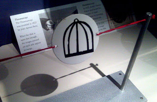
The
thaumatrope
was invented by John Ayrton Paris. I have always thought this playful optical illusion was cute ever since I saw it featured in Tim Burton's Sleepy Hollow. On one side is a cage, on the other side is a bird, but if you twirl the strings on both sides fast enough, the bird and cage become one. The illusion works because of it's speed, it allows our brain a moment of rest which makes it appear as if the images are moving.


While participating in the stop motion exercise with little props including an adorable green frog, I was able to create a 10 second clip of a frog fighting a dinosaur, definitely Oscar worthy if you ask me. The only thing that topped my little frog clobbering a dinosaur was the sound recording room, where my classmates dubbed over the voice of Babe, which was priceless.


All in all, the museum was definitely worth the venture out to Queens. I learned that throughout the years, people have vastly improved the quality of video and audio, from the first film camera to the first personal, portable video camera, humans have continuously invented ways to express themselves through their filmed subjects.


Until next time...


Jenni


PS: Coolest thing ever!


Monday, February 16, 2009

1st Post!!!

Welcome to my blog...
Please enjoy
Much more to come
See u soon
xoxo
Jenni